Fortune: building a design system for a multi-property publisher
A design system built from scratch for one main site, four microsites and an internal app, with four brand themes on one core. The build took two months; adoption took much longer. Here's how it worked, how it got into code, and what I'd do differently.
products on one system
6
brand themes
4
days per prototype, down from 1–2 weeks
1–2
July 2022 – March 2026, through AscentCore
What this shows
01One design system served a main site, four microsites and an internal app, with brand set at the role level so a component never had to know which brand it was in.
02Prototypes went from one to two weeks to one to two days, close to drag and drop from existing components.
03The build took about two months and adoption much longer; the lesson is to bring evidence first, before asking anyone to change their roadmap.
summary
What this is
From July 2022 to March 2026 I led design for Fortune, through AscentCore: a team of three to six designers, working with twelve to thirty developers. In that time we built a design system from scratch and moved one main site, four microsites and an internal app onto it.
The system was built in late 2022 and early 2023, before AI was writing UI. Nobody designed it for a model to read. It's here because the foundations it needed are the same ones AI needs today, and because the build turned out to be the easy part.
Where it started
When I joined, there was no design system. Figma projects had no clear structure, so designers, PMs and developers wasted time finding things. There were no standard components, which meant inconsistencies and a slow handoff to development. Nothing was documented. Fortune Recommends, the product-review section, had outdated flows and navigation.
None of that is unusual for a team shipping on several properties at once.
Structure before components
The first thing I changed wasn't a component. It was where things lived.
Decision
Fix where things live before building components
Why
Designers, PMs and developers wasted time finding things, and the handoff to development was slow.
Result
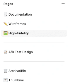
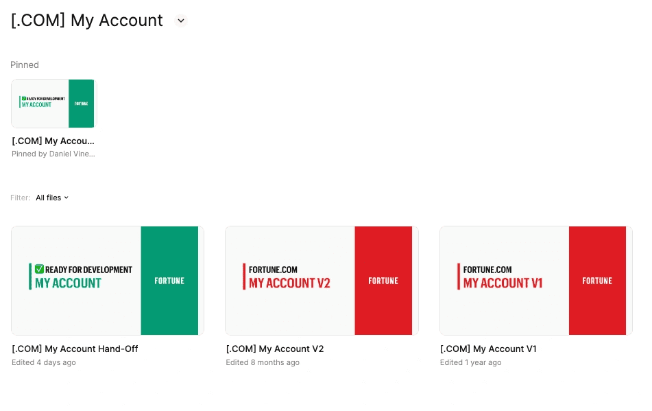
Every Figma file got the same pages in the same order, and every feature a dedicated hand-off file, marked ready for development and separate from the working versions. The design process went into Confluence.
decision / card-01
The same pages, in the same order, in every Figma file.
One project per feature: the hand-off file, marked ready for development, is separate from the working versions.
That sounds like housekeeping. It's also the precondition for a system.
You can't make people reuse components they can't find.
One system, four brands
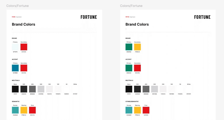
The system had three levels of tokens: raw values at the bottom, roles in the middle, components on top. Variables were split across four brand themes. A role like brand-primary had a different value on each microsite, while neutrals and semantic colors (success, warning, error) stayed the same everywhere.
That split was the main design decision.
Decision
Brand at the role level
Why
One system for every property, with each one keeping its own brand.
Result
A component never had to know which brand it was in. It asked for brand-primary, and the theme answered.
decision / card-02
Two brand themes side by side: neutrals and semantic colors are shared, brand colors change with the theme.
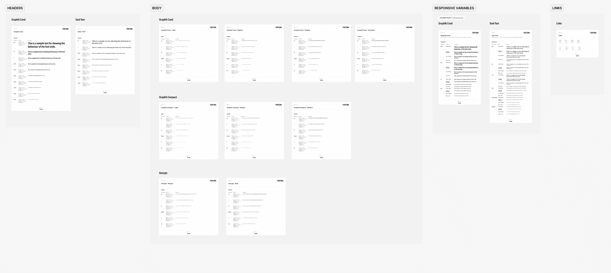
On top of tokens sat a grid with breakpoints, then components, then patterns, then page templates. Typography was part of it too: Graphik Cond and Saol Text for headings, Graphik Cond, Graphik Compact and Georgia for body text, each with responsive values documented next to the styles.
Typography styles for headings and body, with their responsive values documented alongside.
Building it took about two months. I did it with one other designer, as side work, next to the feature tickets from product. That detail matters later.
Getting it into code
The system lived in Figma, and the developers implemented it in code. Two developers owned that work.
Decision
Migrate token by token
Why
Feature work always came first, so the system could only arrive in pieces, alongside it rather than instead of it.
Result
Tokens first, then page by page and component by component. I made the case for what would pay off first; the tech lead decided the order.
decision / card-03
Adoption took much longer than the build. Feature work always came first, and for a long time the system wasn't seen as a priority: people didn't yet see how much it would help. That changed once it was ready and they saw what it saved. After that it got real priority.
In later phases, we used the Figma MCP server to migrate system components into Storybook.
What it changed
Before the system, a prototype took one to two weeks, depending on complexity. After it, one to two days, close to drag and drop from existing components.
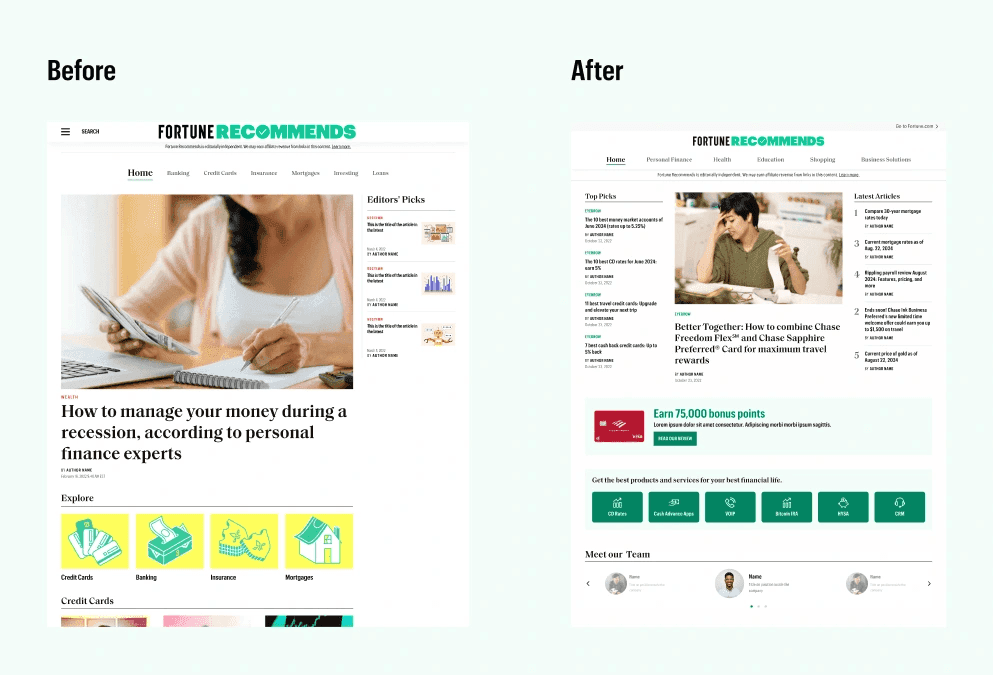
The clearest proof was Fortune Recommends. We redesigned it on the system: card comparisons, review templates, landing pages, and a new navigation.
Fortune Recommends home, before and after.
What I'd do differently
Bring evidence first. The system itself went to plan. Adoption is where I'd change my approach. I asked for priority with an argument, and the evidence (one to two weeks down to one to two days) only existed after the system was built. Next time I'd bring the evidence for why a design system matters at the start, before asking anyone to change their roadmap.
Make the code layer part of the system. I didn't have visibility into how the tokens landed in code. Today I'd make the code layer part of the system, not a separate implementation.
Two sources of truth that happen to agree, until they don't.
Why it matters for AI
This system wasn't built for AI. But look at what it had: roles instead of raw values, so a component asks for brand-primary instead of a hex code; tokens in three levels; documented process and styles; templates that turn a new page into assembly.
Those are the foundations a model needs to produce on-brand UI. The demo on this site shows the difference in practice. The piece Fortune didn't have is the one I'd change anyway: a code layer that comes from the system instead of being rebuilt next to it.
What a client gets
Someone who has built a multi-brand system and lived through its adoption. The AI-Readiness Review is the Fortune lesson turned into a first step: it brings the evidence first, before anyone is asked to change a roadmap.
AI-Readiness Review: your Figma library, tokens and documentation, scored, with a prioritized fix list.
Audit + Roadmap: the code side as well, plus a roadmap that plans adoption, not just the build.
Design System Partner: senior help every month to carry that roadmap out with your team.